Main Gallery
IS THIS ONE BETTER?

BeachScraper,
at 01:01PM on Sunday February 08, 2009
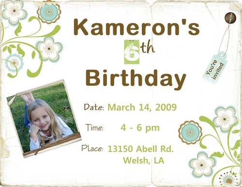
I like the overall effect of the invite, love the flowers, picture, and colors. One thing I would change would be the font of "Kameron's & Birthday". Maybe more flowery, more girlish, I like the color, softer. Just my thoughts.
JENNA,
at 01:16PM on Sunday February 08, 2009
Thank you... Do you have a certain font in mind? It takes me so long to make a decision.. ha. You LO's are always sooo good... let me know if you know of any fonts... You are right - a more girly one would look better. Again, thank you!
weblg,
at 02:52PM on Sunday February 08, 2009
Very nice...I would come if I received a great invitation like this one! Good suggestion about the font...If interested, I like a font called Licorice Strings..I think it is sort of "girly".
JENNA,
at 02:35AM on Monday February 09, 2009
THANK YOU - I WILL TRY TO FIND THE FONT YOU ARE TALKING ABOUT.. YOUR HELP IS GREATLY APPRECIATED.
JENNA,
at 12:28PM on Monday February 09, 2009
I LOOKED A LITTLE AND COULD NOT FIND THAT FONT. DOES THIS LOOK OK OR SHOULD I KEEP LOOKING? I WILL HAVE THEM PRINTED AS 5X7'S SO, SOME OF THE TOP AND BOTTOM WILL ACTUALLY BE CUT OFF. RIGHT NOW IT LOOKS LIKE I HAVE TOO MUCH ROOM ON THE BOTTOM ETC.
weblg,
at 03:19AM on Tuesday February 10, 2009
I think I like the new one better...I google the font (I was not sure where is came from) found it at DaFont.com. It might not work with what you are after (it is a skinny font).
JENNA,
at 11:51AM on Tuesday February 10, 2009
Thank you so much - I will ck. into it. I would like to see it and also have it w/ my other fonts... Thank you for all your help!!!

Comments